
Responsive Design
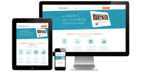 Responsive web design, sometimes called RWD, is a way of creating websites so they adapt to many different devices and screen sizes. The goal of a responsive website is to provide an excellent viewing experience on many different monitor resolutions, phones, and tablets. Implemented correctly, multiple devices can visit a responsive website and they will see a visually attractive layout no matter whether the screen is big or tiny.
Central to the concept of responsive web design is a design methodology which adapts the site layout to the user’s viewing environment with flexible image sizes, fluid and proportionally-based grids, and media queries which select the appropriate CSS style sheet for the screen size.
In practice this means a few design choices define a responsive website:
- The use of fluid grids, which size page elements in relative units such as percentages (rather than points or pixels, which are absolute units)
- The use of images sized in percentages or other relative units, so they dynamically resize to the screen
- Implementation of CSS3 media queries, which dynamically choose a style sheet based on the browser window width
- Often, the use of server side components — in a technique known as Responsive web design with Server Side components, or RESS — to handle some of the limits of client-side only responsive design techniques
Responsive design is generally used as a replacement for traditional “mobile” websites, recognizing that the broad range of screen resolutions encountered on different platforms mean that it is no longer enough to have a “regular” and a “mobile” website. Tablet users, for example, occupy a space between laptop users and mobile devices, yet providing an optimal experience on a tablet requires different design choices than for laptops or mobile platforms.
A responsive web design maximizes your budget. Why? You only need to create one website. If you have an older site it can be made responsive, but it costs almost as much as a new or completely redesigned site.
When you are evaluating which web design company to engage, ensure the price quotation includes (1) CMS (you can update it yourself) and (2) Responsive Design. Based on the sales and growth of tablet and smart phones, all websites since 2014 must be created as responsive to ensure your prospective customers and customers can see your website content regardless of the device they are using.
Interesting in seeing how your website looks on various devices and screen resolution.
Please type in your domain name/URL is the box below: